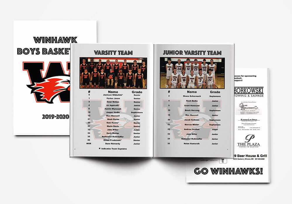
Basketball Roster

Overview
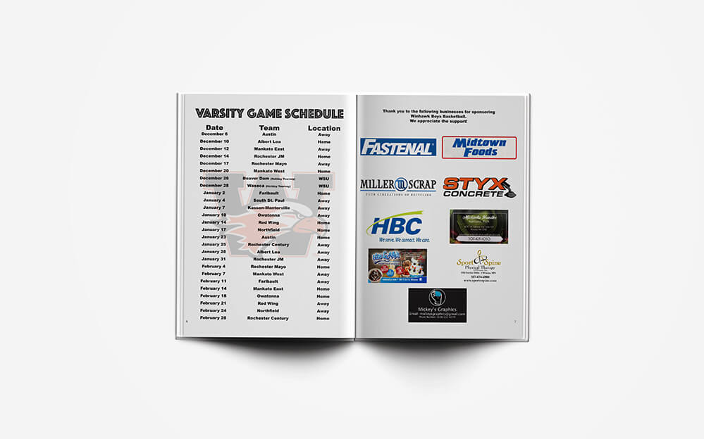
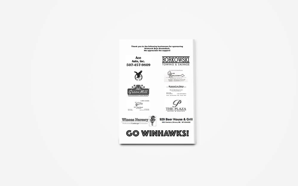
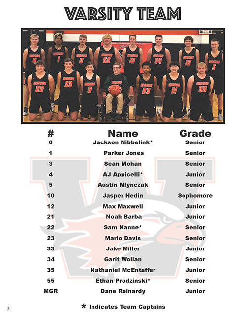
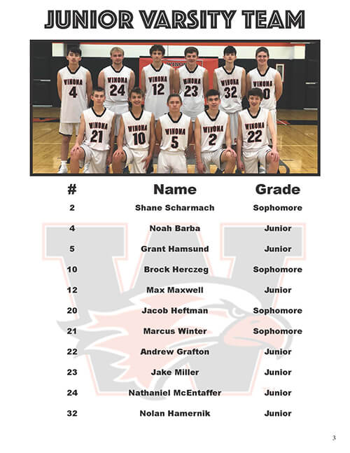
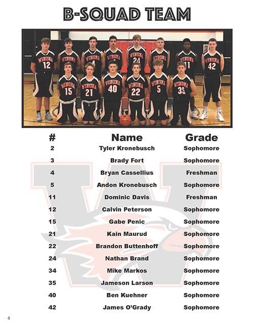
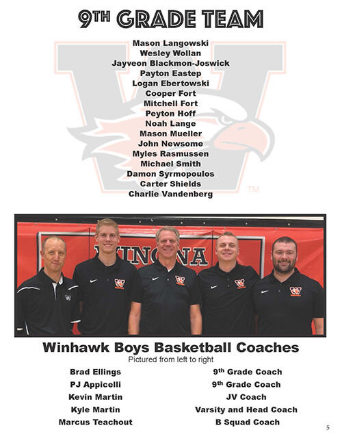
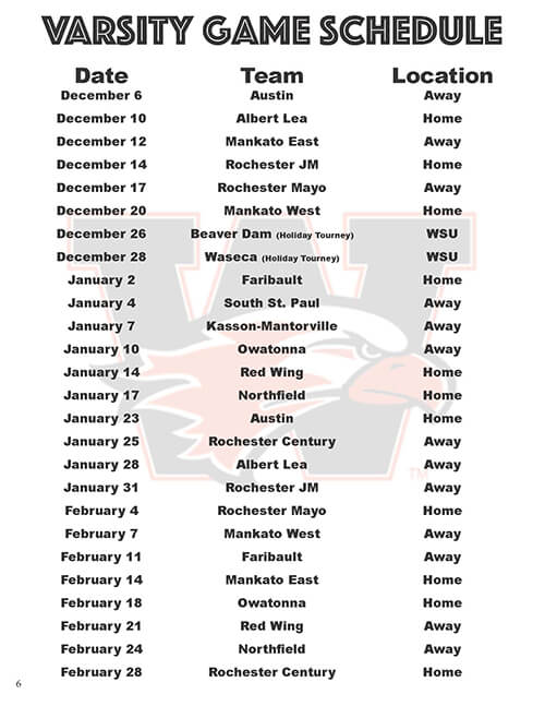
When the parents of the local high school basket team approached me hoping for some help I knew I couldn’t say no. The only problem was I was briefed on this project on the 6th and they needed it printed by the 10th. It was a challenge but I managed to get this turned around in two days.
Design Elements

Explanation
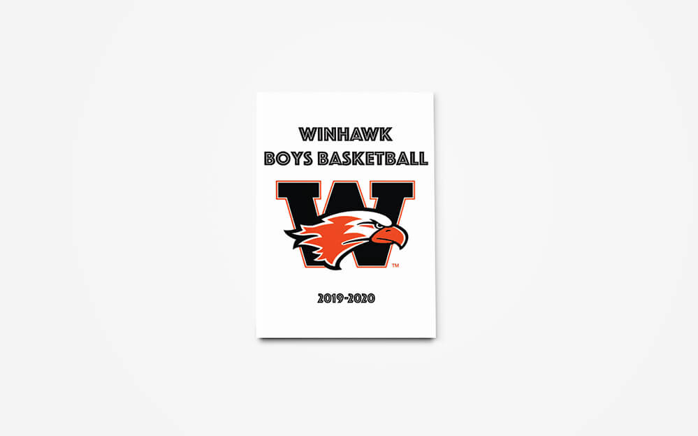
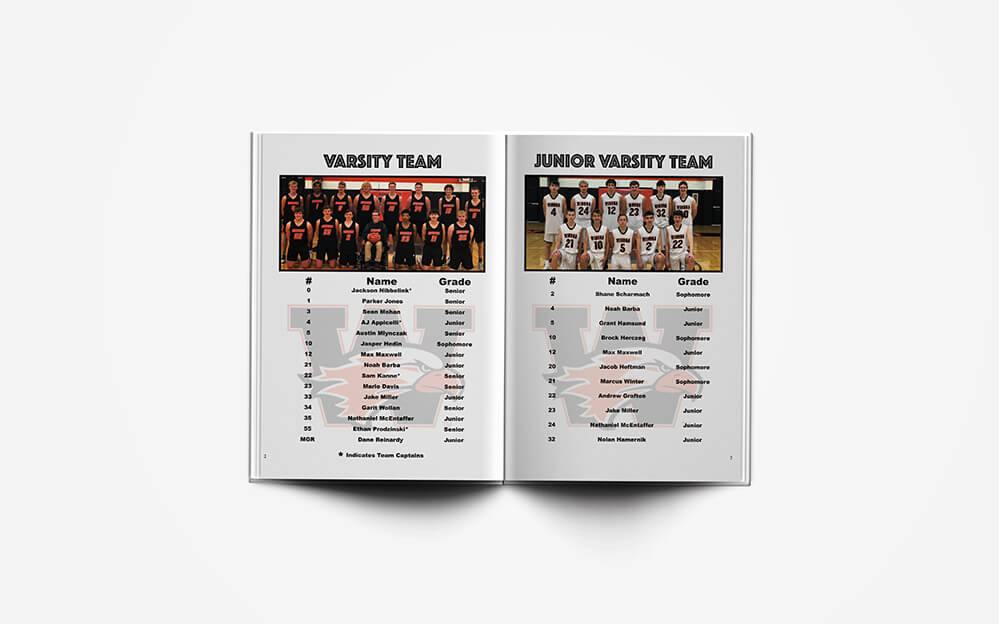
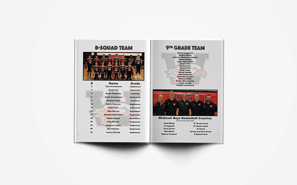
For the headings I wanted to use something fun, young, and bold. Thats how I ended up with the font Phosphate. For the rest of the font I wanted to focus on readability. Thats how I ended up with arial black. It was the perfect blend of readability while being a heavy enough weight that’s its easy to read.
Concept
Final Thoughts
All in all I think this project turned out well and it’s a good example of keeping a tight deadline. I’m happy I got to help out our local high school team.
