Wedding

Overview
For my wedding we had a travel theme so I decided to really run with that when designing all the paper products we were going to need. We used “save the dates”, invitations, and website cards. We chose not to have programs due to our wedding being outside, we wanted to avoid any littering.
Design Elements
Explanation
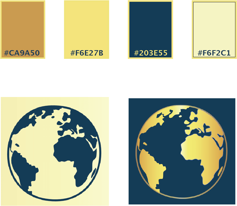
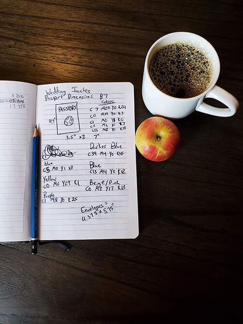
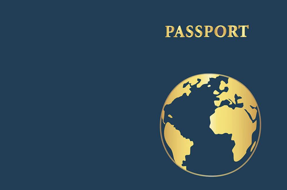
I based my color choices off of the American passport to fit with the travel theme. Since I didn’t want to spend the extra money to get my invitations foiled with gold I decided to mock gold by using a gradient of yellows and brown.
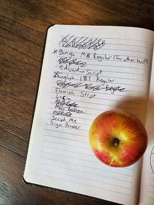
For my fonts I wanted one to be very script-like and romantic so I chose English 157 BT. I wanted my other font to be very clean and readable so I chose a San-sarif. I finally landed on Bangla MN because not only did it have the look I wanted but bangla is my husbands native language.
Concept
Invitations
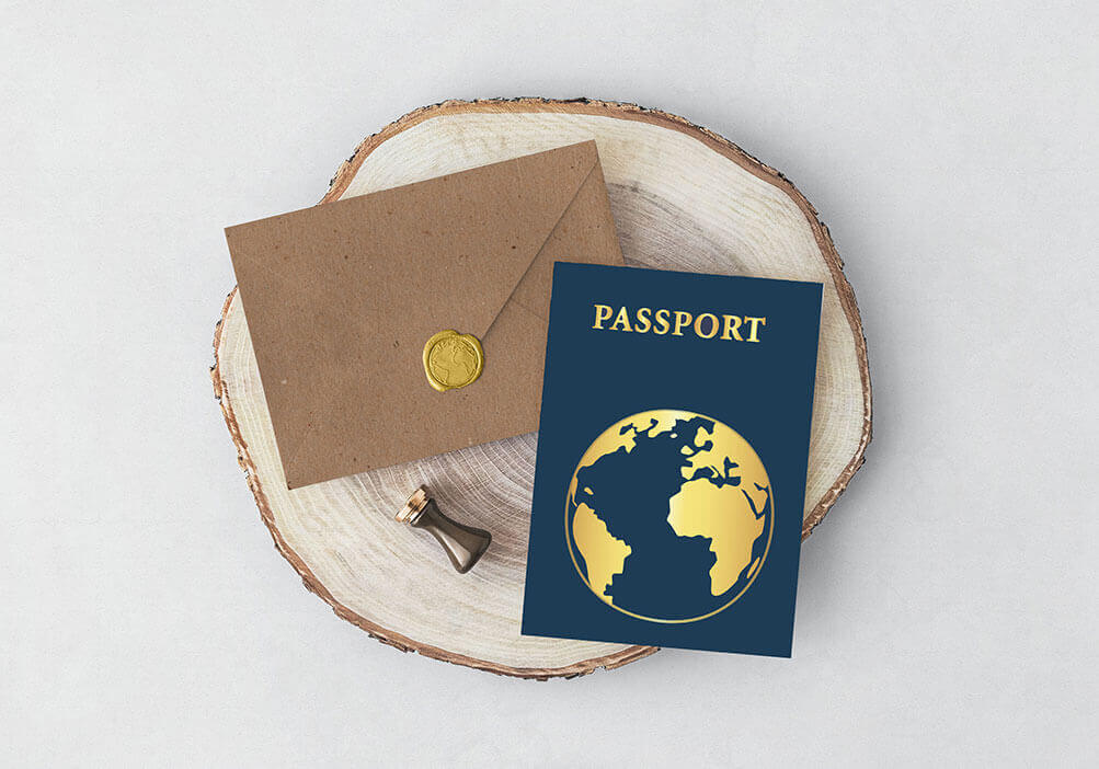
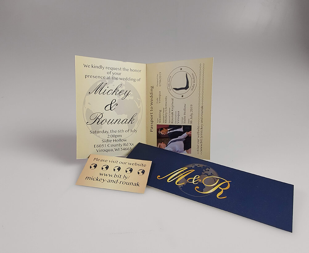
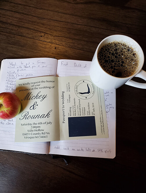
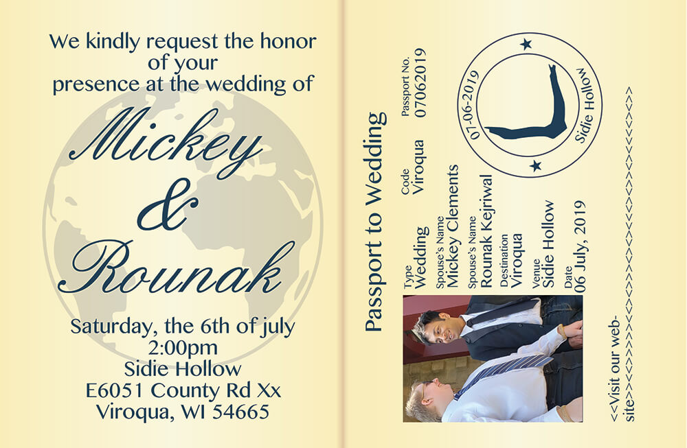
My invitations were based on the American passport. Instead of leaving the left side blank I put the information in the traditional manner to save confusion. This worked really well for my older family members especially. I’m pretty proud of how it ended up working out and received tons of compliments.
Save the Date
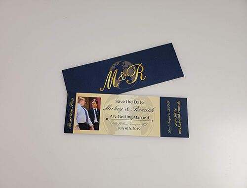
For the “save the Dates” I designed them to look like boarding passes. On the section that would get torn off I put the website information in hopes of getting people to go check it out.


Website Card
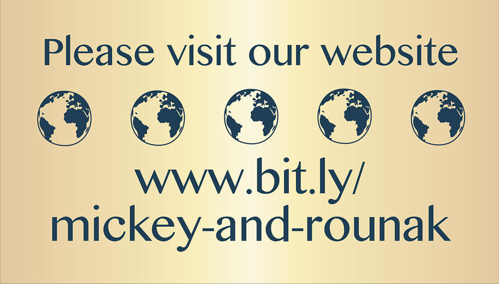
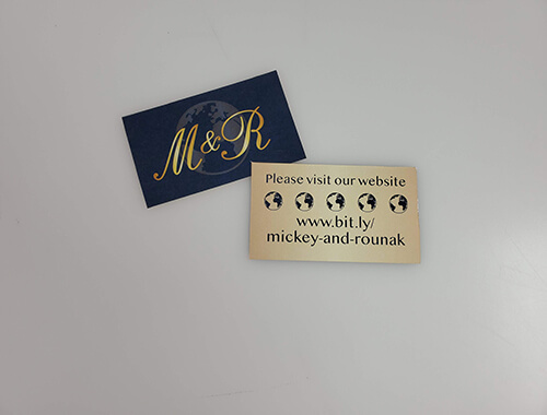
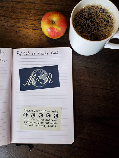
Just in case people didn’t notice mention of the website on the invitation I included a “website card. This way not only was it extra clear that there was a website but if the managed to misplace the invitation they had a convenient way to find the information they need so long as they still had the website card.
