To visit the website
Click here!The Wee Repeat


Overview
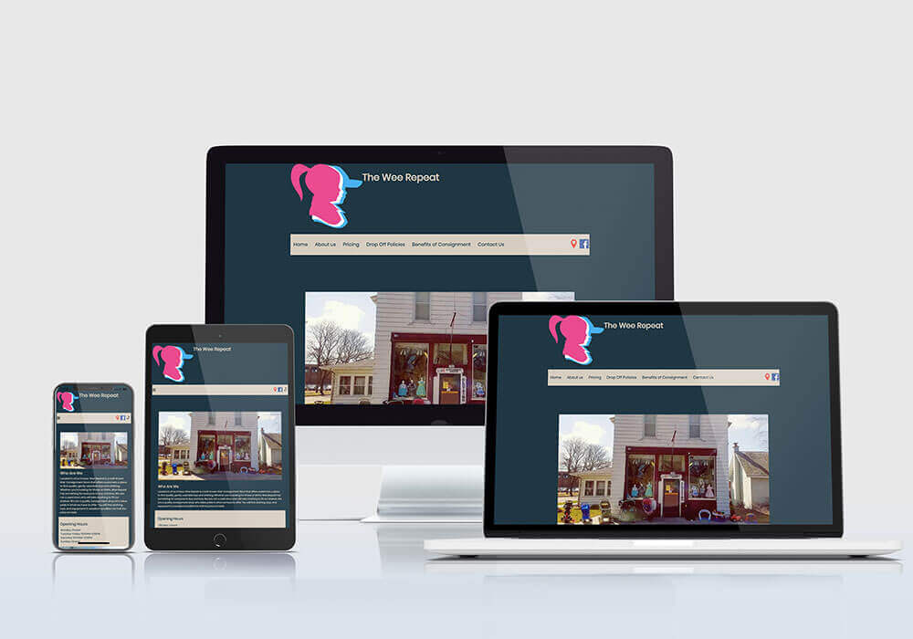
The Wee Repeat is a local kids consignment store. I’ve done a considerable amount of work for them including designing them a new logo, building their website, redesigning their brochure, building them a landing page, and designing a semi-annual facebook advertisement for there sale “Dollar Days”. They’re a great client to work with because of there openness for new ideas and long standing history in the community.
Website

Design Elements
Explanation
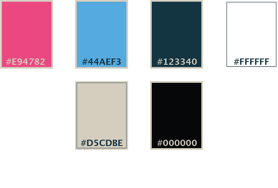
I chose the first two colors due to the stereotypical baby blue and baby pink. The other colors were picked by the client.
Home Page
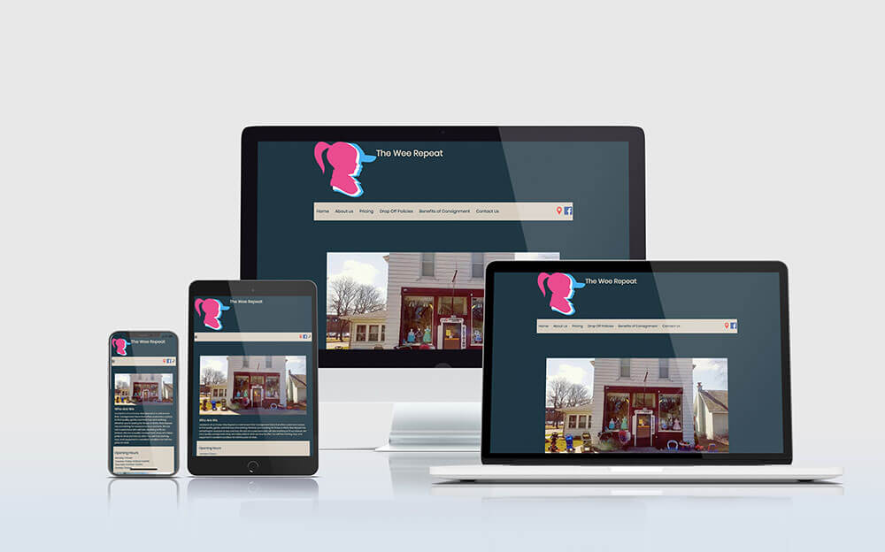
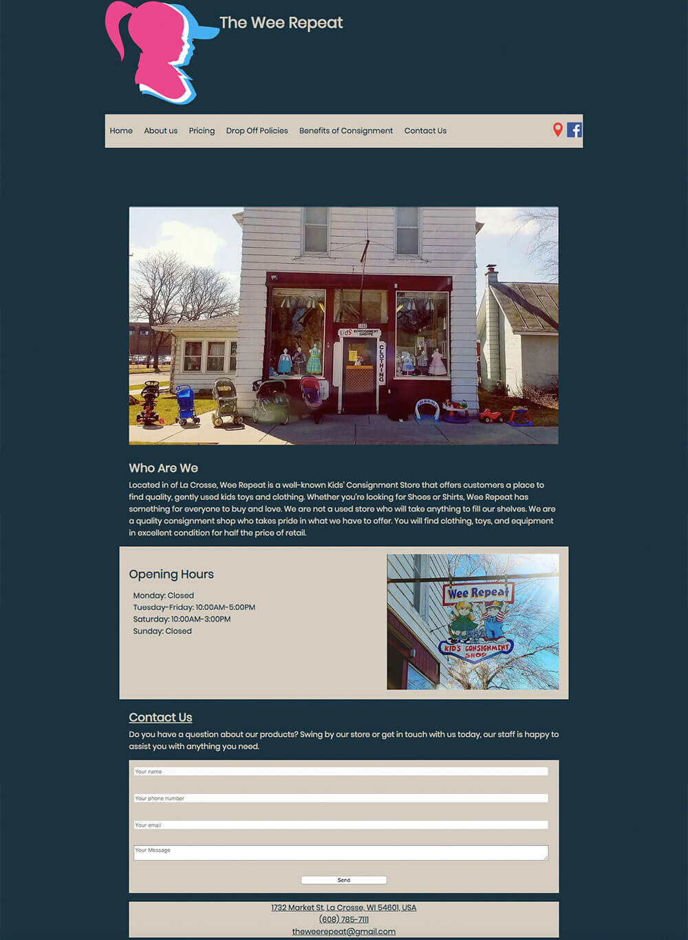
For the home page I included a picture of the building along with a short description of the business. I also included business hours and lastly a contact form for clients with questions.
About Us Page
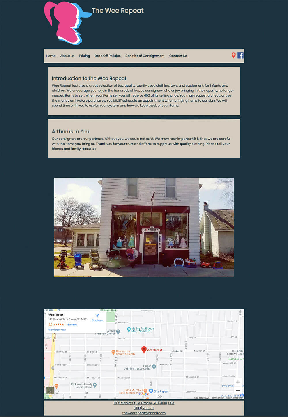
On the About Us page I gave a short introduction to the Wee Repeat and then gave thanks to the consignors that contribute to the shop. I then showed the image of the shop and a map to the shops location.
Pricing Page
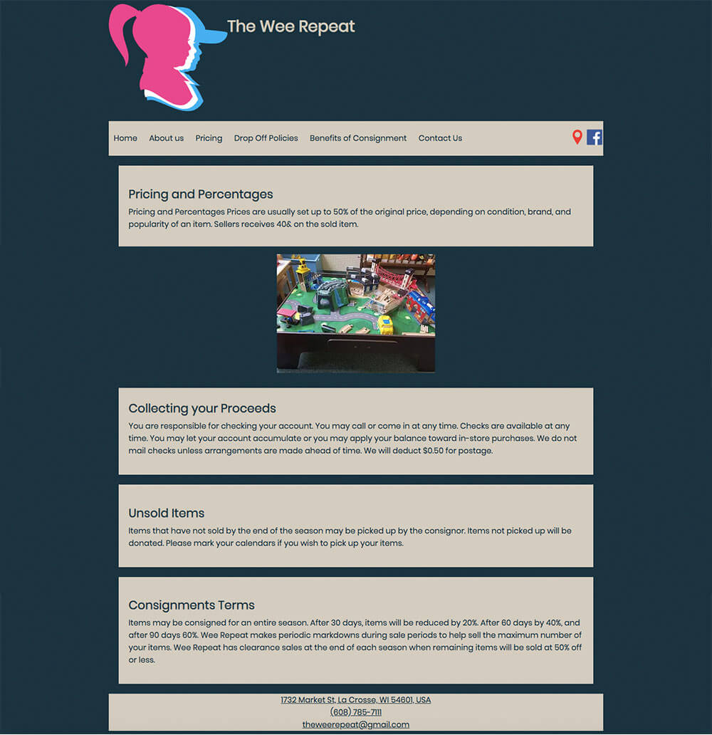
For the pricing page I started with an explanation of how the stores pricing works followed by an image to try to break up the text a little. Then I followed that up with an explanation on how collecting your proceeds, how unsold items are dealt with and finally Consignment terms.
Drop Off Page
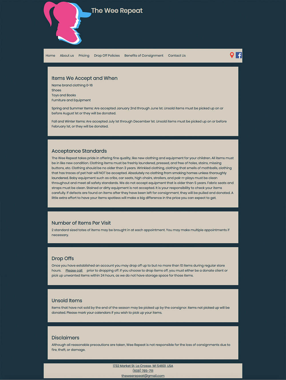
The drop off policies page is the longest by far. There is so much information the clients might need so it was clear I was going to have to use it all. I tried to break it up in to small manageable sections that would make sense so users could find what they need quickly. The sections include: Items We Accept and When, Acceptance Standards, Number of Items Per Visit, Drop Offs, Unsold Items, and Disclaimers.
Benefits of Consignment Page
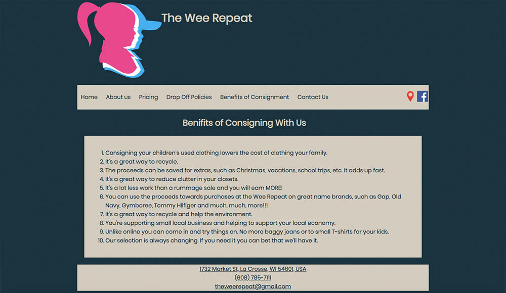
This is a very short page but the client was passionate about having it so we gave it its own page.
Contact Us Page
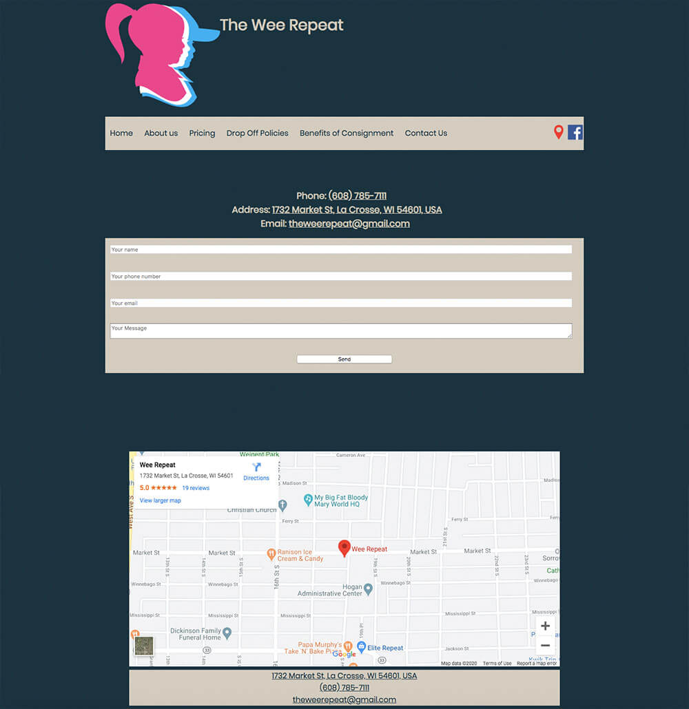
Lastly was the Contact Us page. On this page I included all the information needed to contact the Wee Repeat, followed by the in site form, and lastly a map to get to the location.
Broschure

Design Elements
Explanation
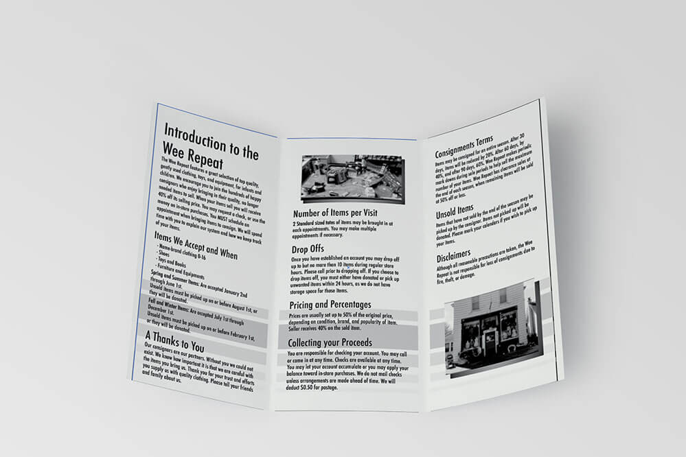
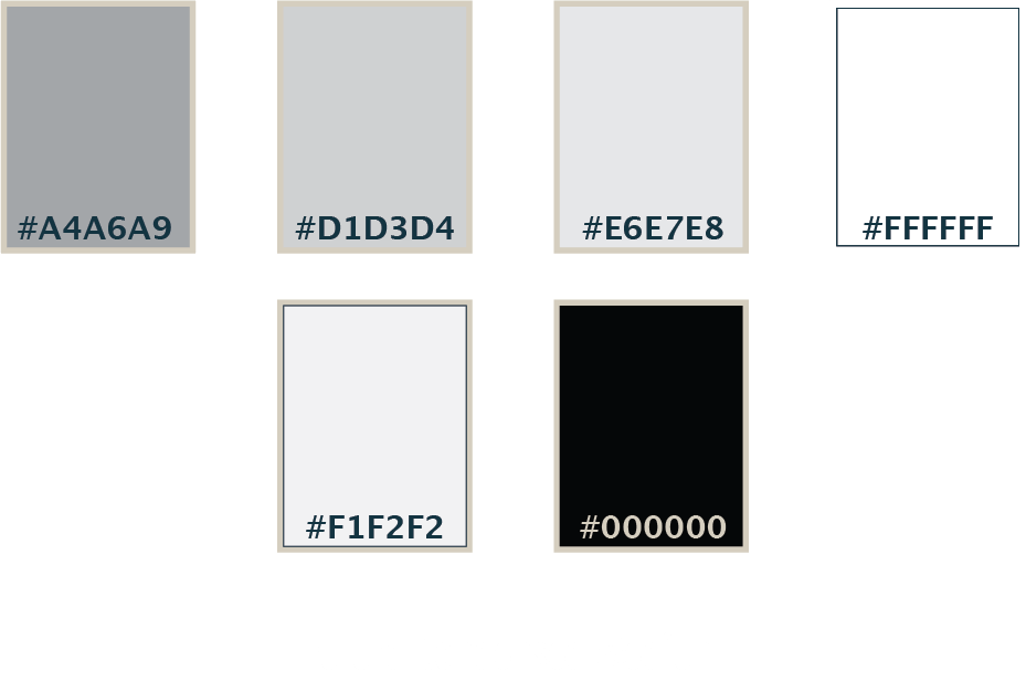
In order to keep printing costs to a minimum I kept this brochure in gray scale. These brochures are often used when people ask about policies for consignment. This way they can take something home they can refer back to.
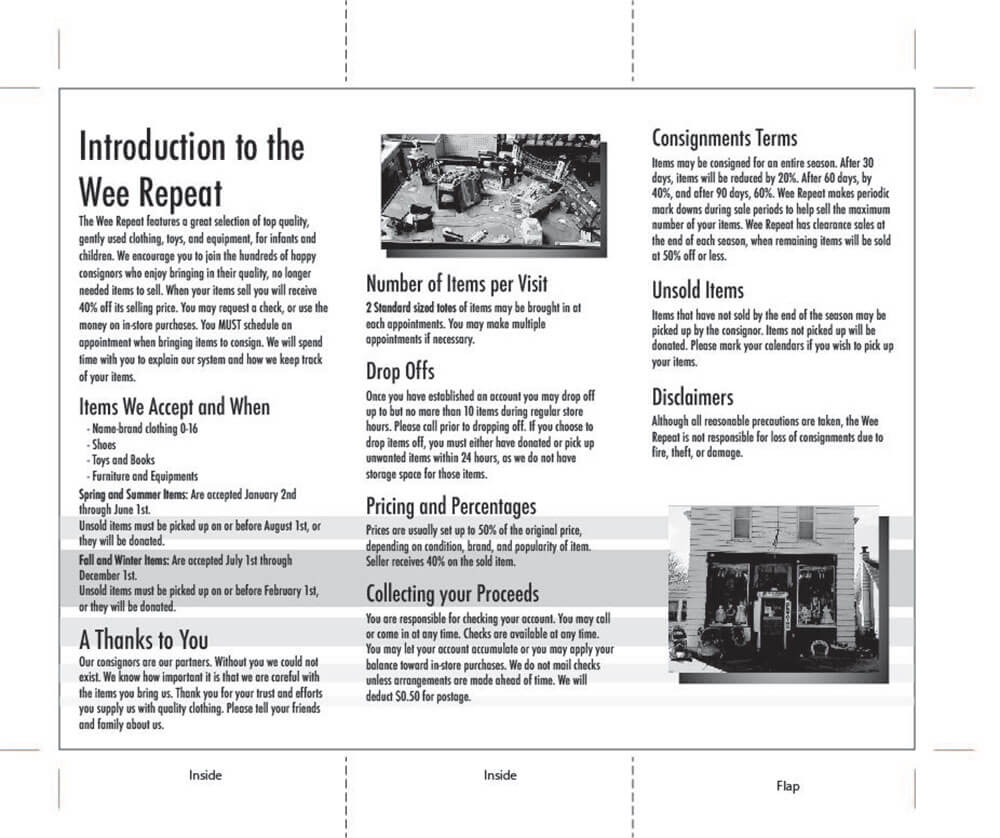
Inside
This is the inside of the brochure. It introduces the Wee Repeat and tells you everything you need to know about doing consignment with the wee repeat.
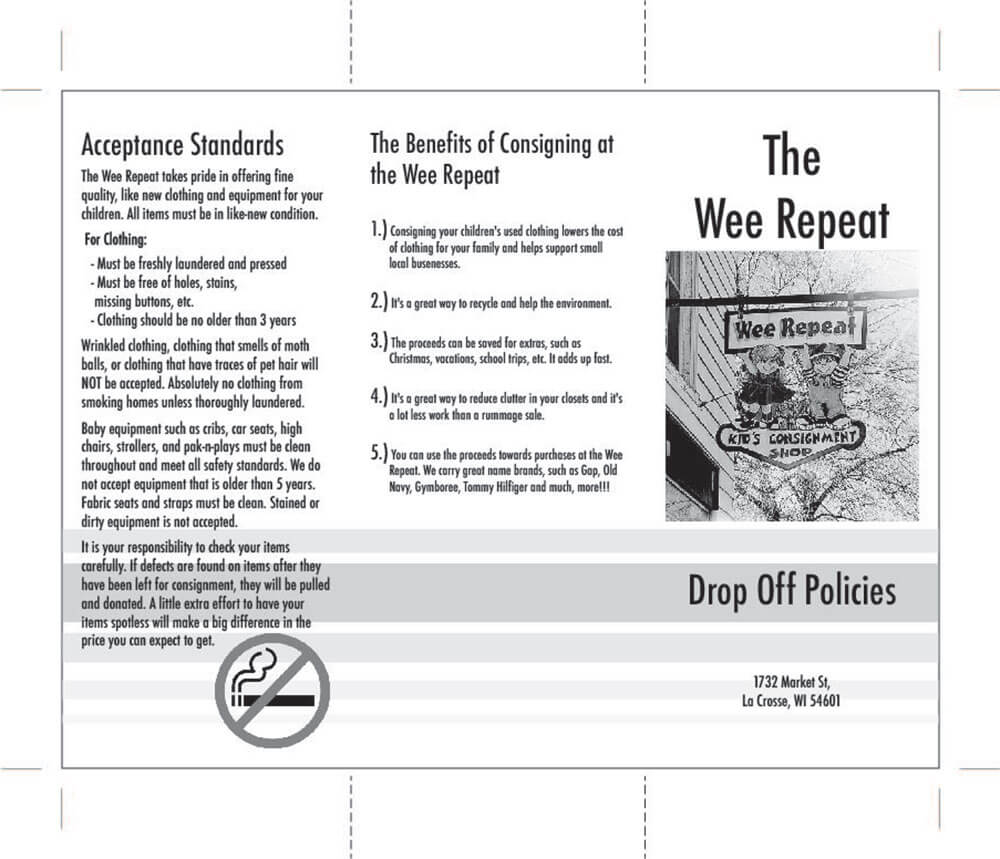
Outside
This is the outside of the brochure. It has the front cover along with acceptance standards and the benefits of consigning at the Wee Repeat.

Logo

Design Elements

Explanation
I chose the first two colors due to the steriotypical baby blue and baby pink. This was one of those logos that just comes to you out of nowhere and I was so excited to design it.


Landing Page

Design Elements
Explanation
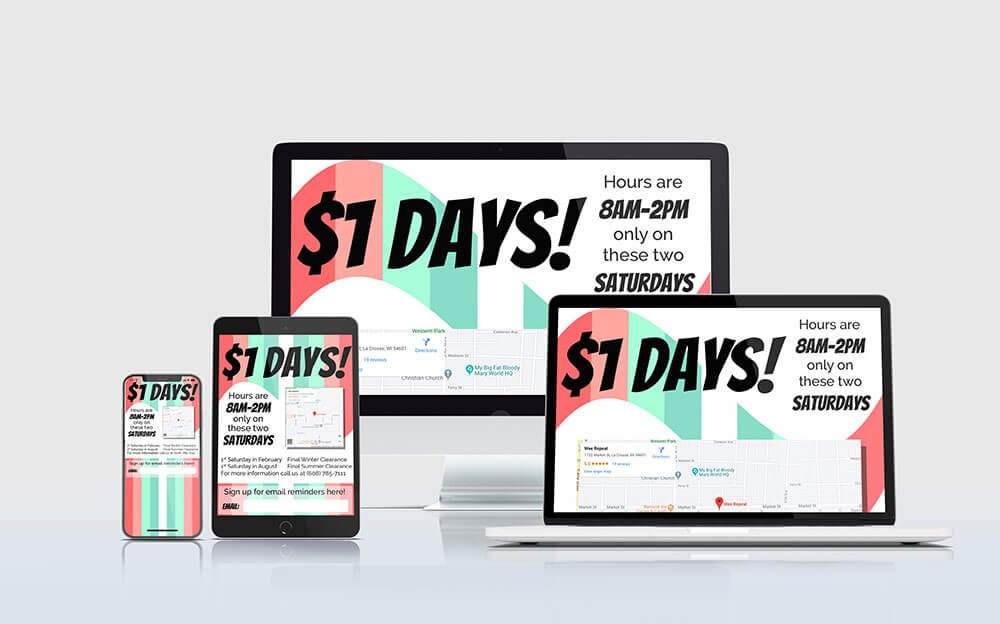
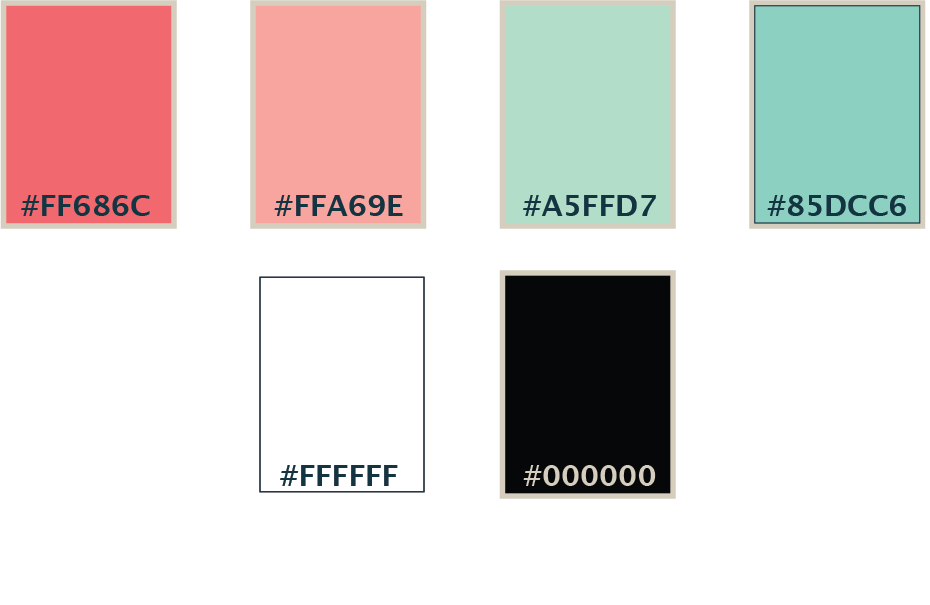
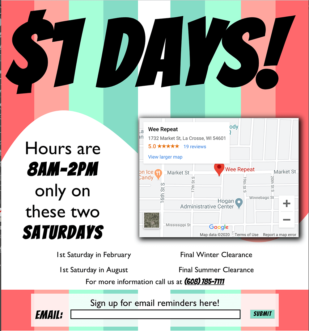
This landing page is used to help promote the businesses bi-annual Dollar Days Sale. I chose these colors to try to target moms for this advertisement. I felt like the fun pastels would really pull in mothers of young kids. I then chose fonts. I used Gill Sans because it’s web friendly and very readable. Then I chose Bangers to give it a fun pop.

Facebook Ad

Design Elements
Explanation
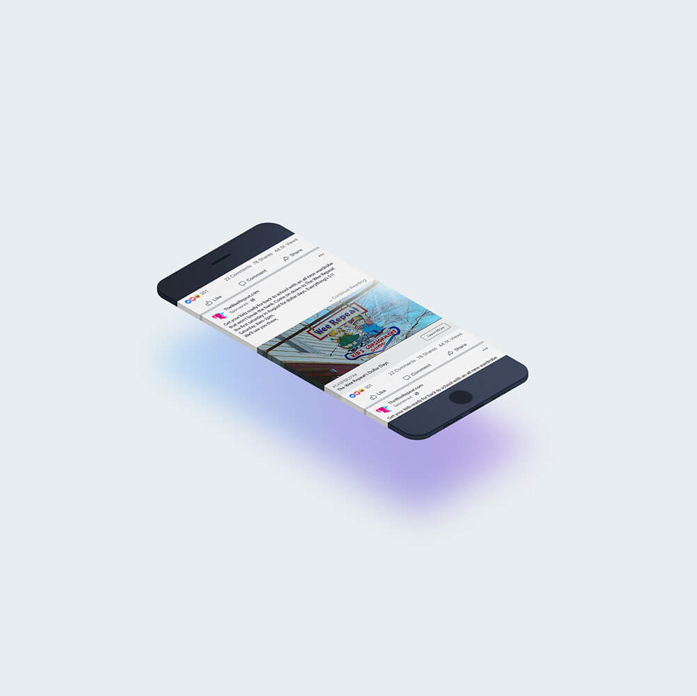
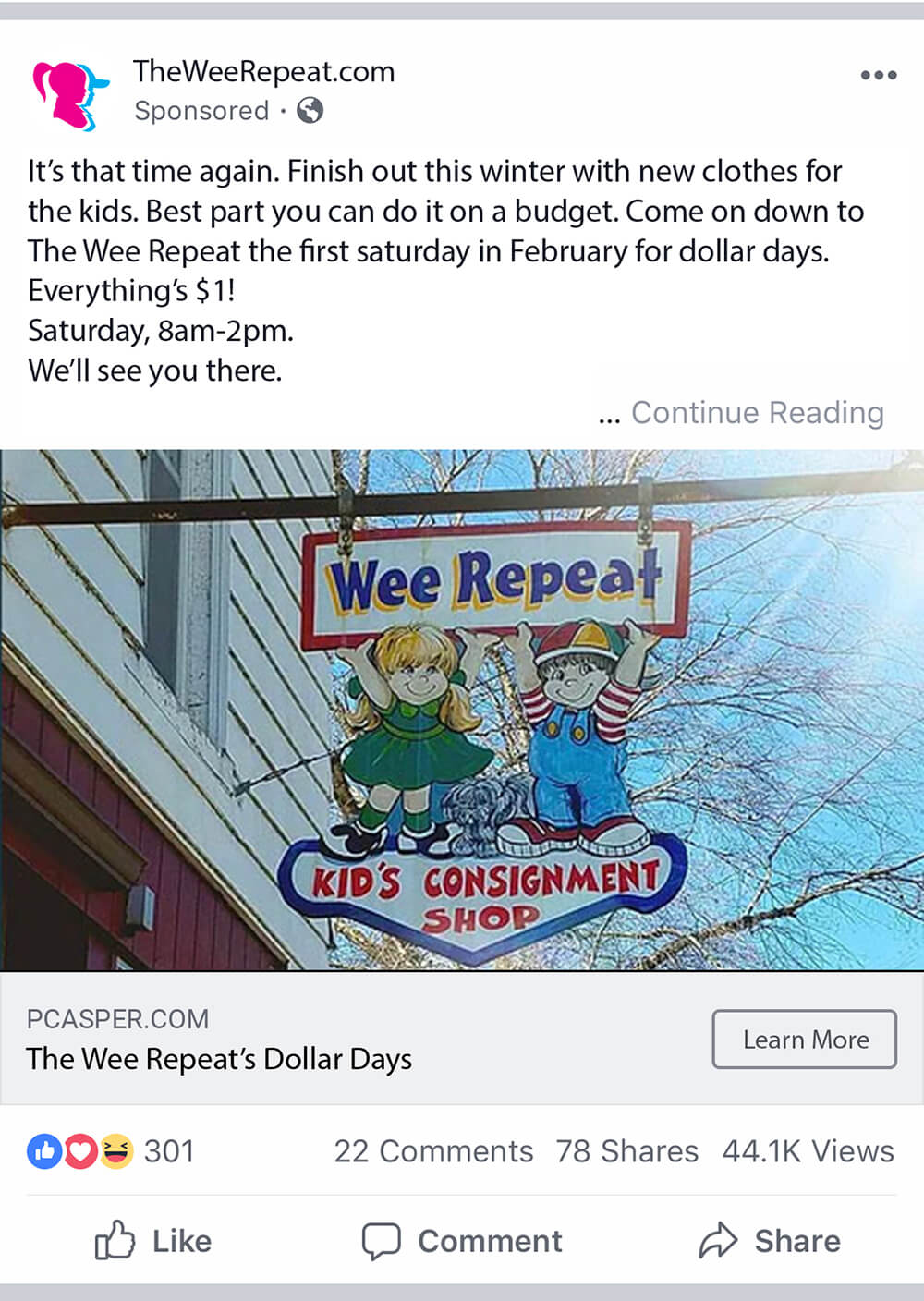
This ad directly links to my landing page and helps to advertise to bi-annual Dollar Days save. It’s meant to specifically target moms in the area.
Concept


The Wee Repeat
