My Brand Identity

Overview
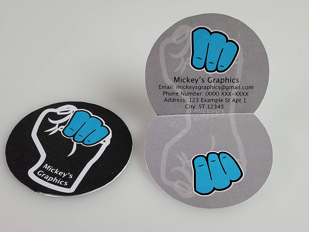
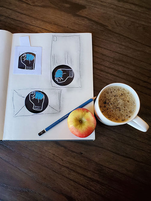
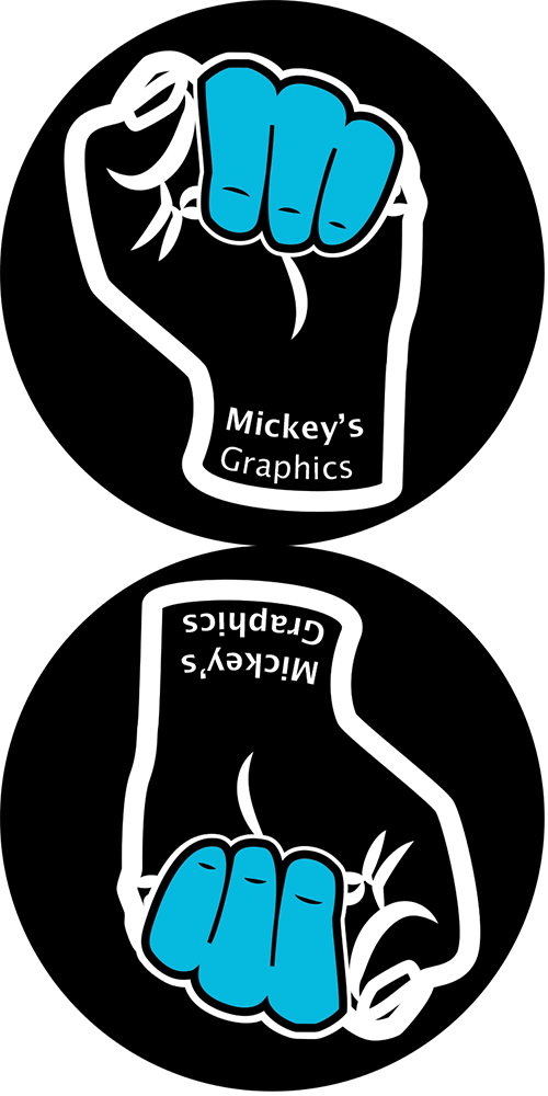
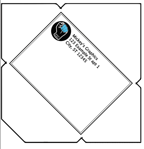
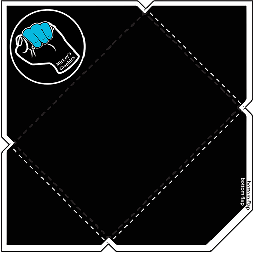
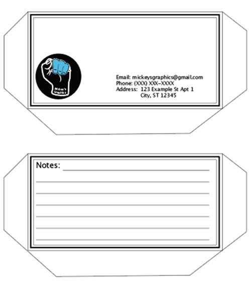
For my brand identity I wanted something striking with an urban feel. I chose to use white on black to give it high impact and I chose line work to give it that urban feel I was striving for. After that I decided I needed some color so I emphasized the three fingers with a striking shade of blue. The reason I wanted to emphasize those three fingers is because they make the shape of an “m” for Mickey. Once I had the Logo designed I designed a business card, folder, letter head, and envelope.
Design Elements
Explanation
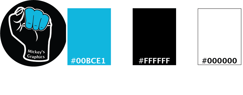
I chose these colors because of my love for the color blue. Other than that I stuck with black and white to keep printing costs low. The reason I chose Lucida Grande is because not only is it one of my favorite fonts but its very readable even when very small.
Concept
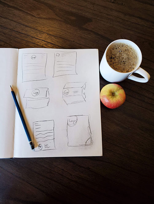
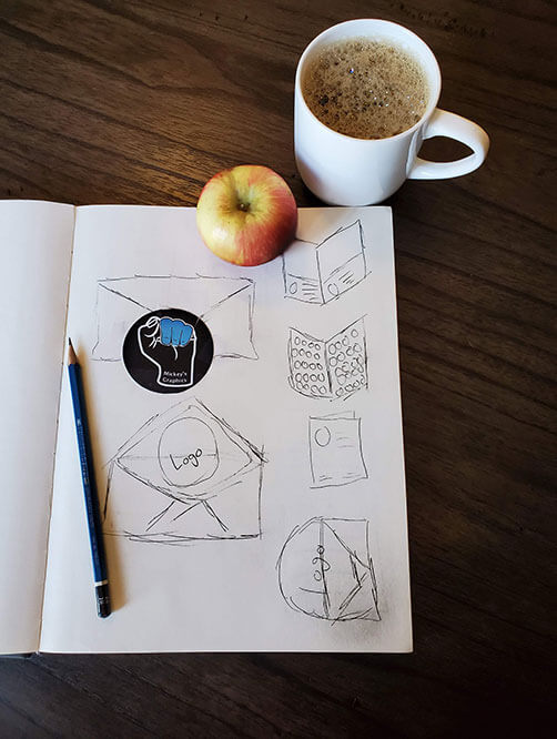
Business Card
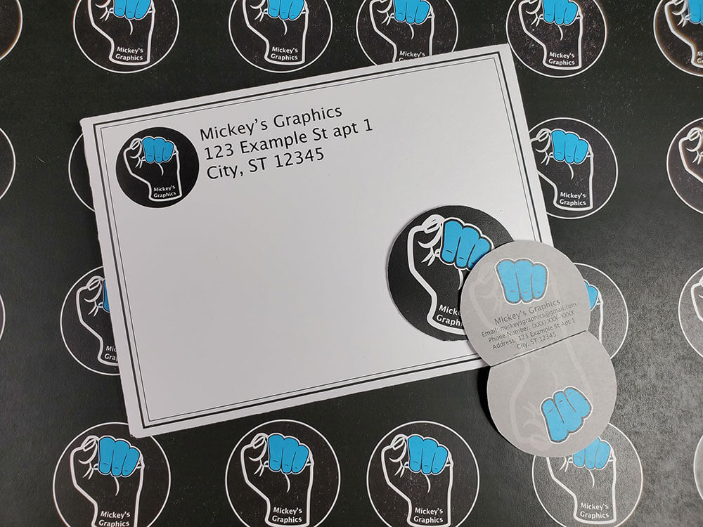
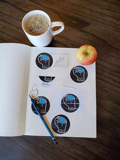
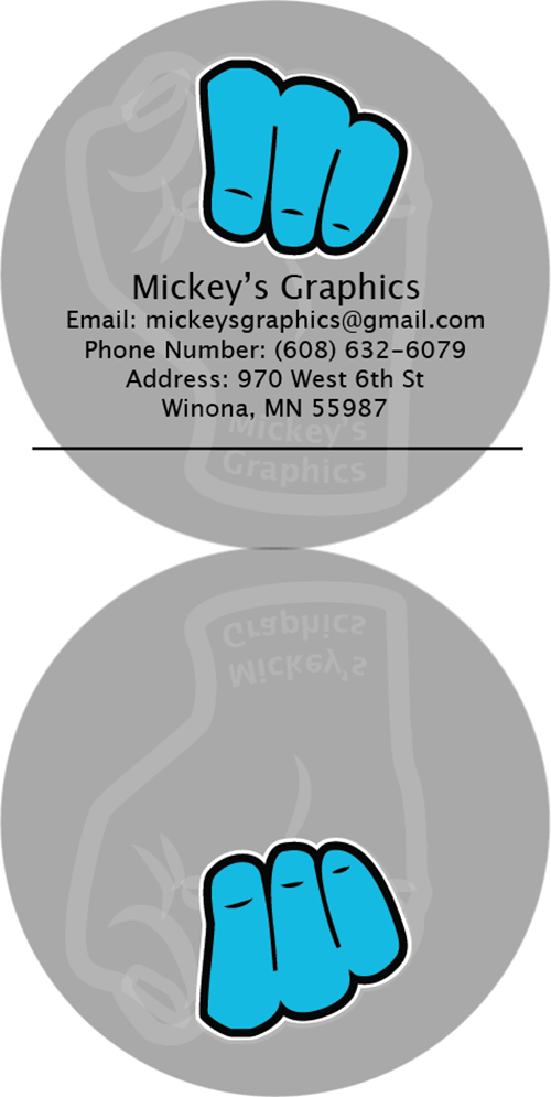
For my business card I wanted to do something non-traditional, thats why I decided to have a round business card. The business card will fold open on the line and by adhered in between to keep it from tearing apart.
Envelope
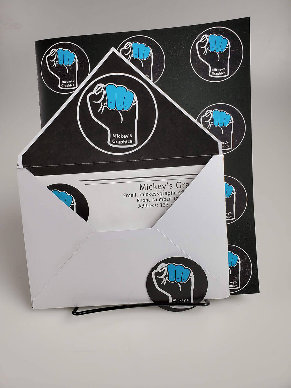
Folder
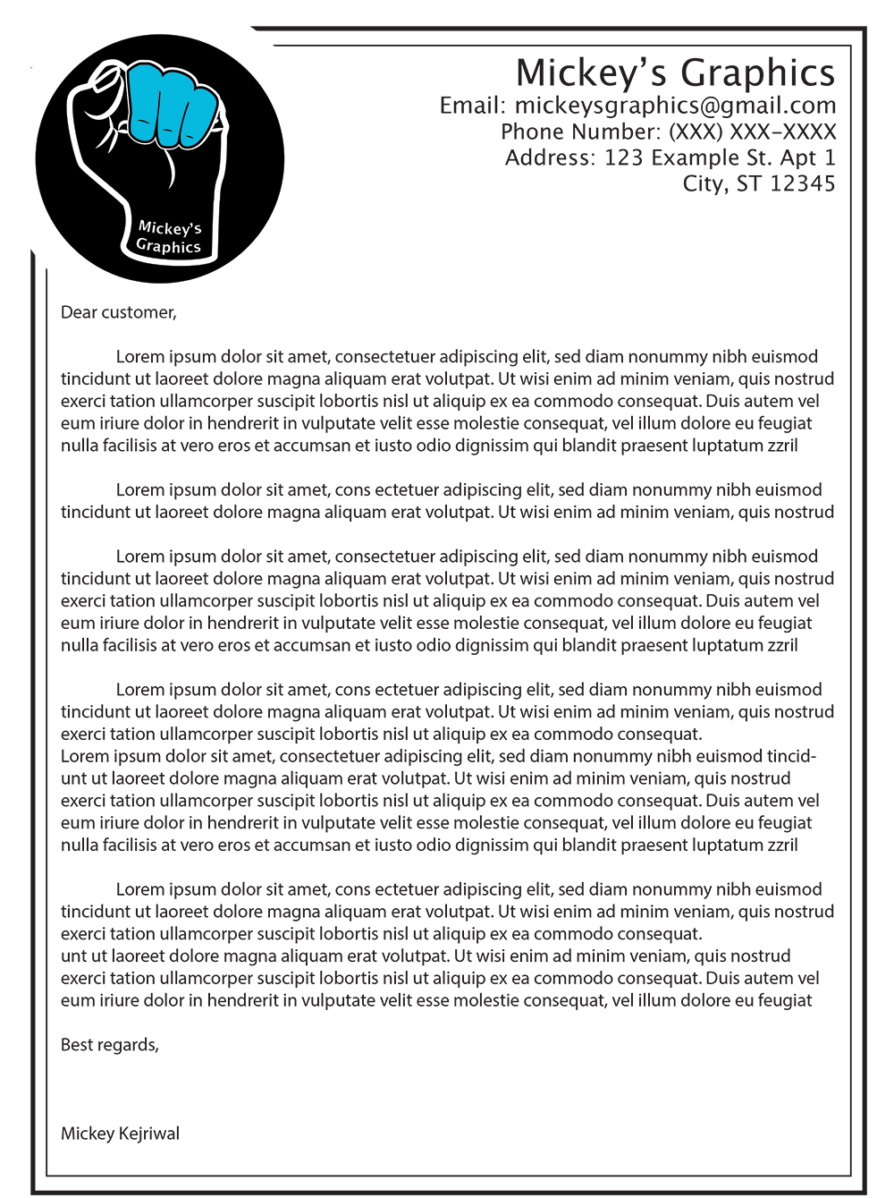
Letter Head
