Allbaugh Properties

Overview
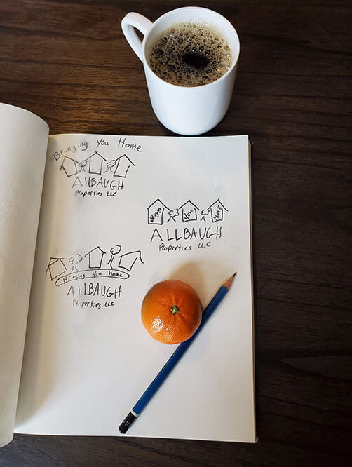
I designed this logo for a local rental/property management company. They wanted something fun and family friendly that would still get there point acrossed. They already had colors picked out but beyond that they didn't have a clue what they wanted.
Design Elements
Explanation
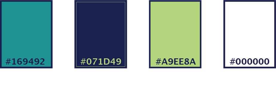
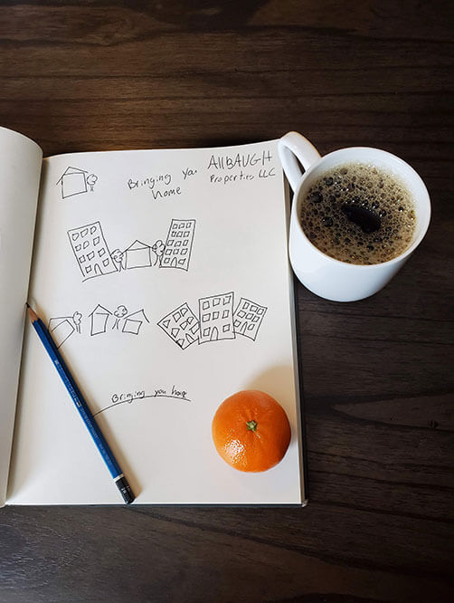
They wanted the colors based loosely on another logo they shared with me and then I used photos inspire the shape of my houses and trees. Also for the third font I painstakingly customized a font to make it the way I wanted.
Concept
Final Thoughts
I really like the way this logo turned out. I think the colors go together really well and I’m glad I spent so much time customizing the font to fit the logo perfectly.
